

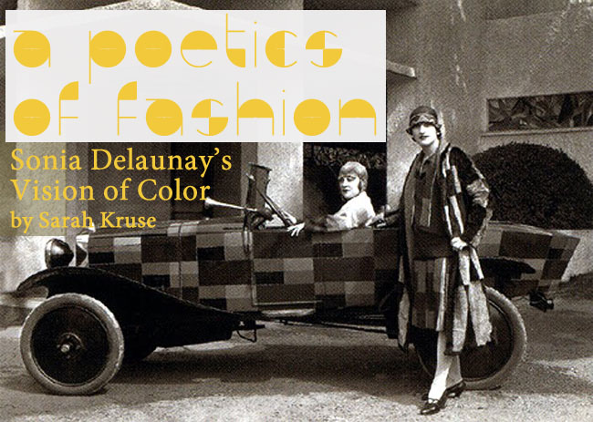
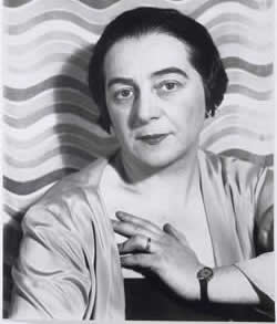
 n the spring of 2011, at the top of the dark walnut paneled stairs beyond the art nouveau portico of The Cooper-Hewitt National Design Museum, Cubist paintings evocative of Braque and Chagall hung alongside a dress, a coat, samples of fabric, and a selection of embroidered cloche driving caps that exhibited the same intensity of color and pattern as the paintings. The Alexander McQueen retrospective was on view down the street at the Metropolitan Museum of Art, and was the talk of the fashion world. The clothing I was looking at, however, was the work of Sonia Delaunay. Perhaps now a lesser-known figure, Delaunay worked not only as a painter, but also an illustrator, fashion designer, costume designer, and textiles designer. In 1964, she was the only living woman honored with a retrospective exhibit at the Musée du Louvre.
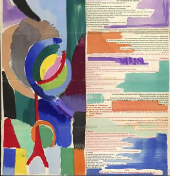 Delaunay’s work carries a powerful sense of movement. Like other abstract painters at the time, such as Wassily Kandinsky, the rhythm and movement of Delaunay’s work evokes a poetic mood. Early in her career Delaunay met, via mutual friend Guillaume Apollinaire, the poet Blaise Cendrars. Taken with Cendrars’s work, Delaunay set out to illustrate Cendrars’s lengthy poem, La Prose de Transsibérien et de la Petite Jehanne de France. The collaboration resulted in La Prose, a two meter long objet d’art hand letter-pressed and folded with a velum envelope hand-colored by Delaunay herself. Only 62 copies were made. Delaunay’s illustrations complement Cendrars’s words; the color becomes part of the movement of the poem. The full sheet contains two columns: Delaunay’s flowing and vividly colored shapes on the left, and Cendrars’s text on the right, although they also are not strictly separate. The justification of the poem alternates from left to right to center, with varying fonts, some in all caps, some in italics, and alternating even in color. In the white space of the text, blocks of color converse with the Cubist painting that occupies the left column, and leaves one asking: Is there a poetics of color?
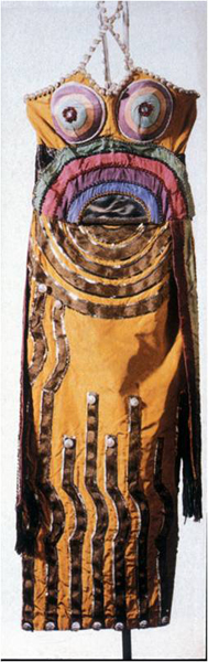 In Delaunay’s designs, shapes move through one another, becoming both a unit and a composite, while remaining separate entities through the differentiation of color. She creates juxtapositions in the visual similar to those a poet creates through sound and language. The intensity of object and color never changes for Delaunay, but rather translates later in her career into fashion and textile designs. She never saw a division between painting and fashion, finding both forms of her work equally important. From a coat designed for Gloria Swanson in 1923 to a Citroen she painted in 1925, Delaunay’s work moved across a variety of mediums, some of its first emergences seen not on models, but on the stage as early as 1918, when she designed the costumes for Sergei Diaghilev’s ballet Cleopatra.
In 1929 Virginia Woolf wrote “a woman must have money and a room of her own if she is to write fiction.” While Delaunay was no fiction writer, she had already realized the importance of economic independence. In 1926, after her husband Robert Delaunay’s abstract paintings failed to bring in a steady income, Sonia opened Maison Delaunay, an atelier for her fashions and fabrics, which remained in operation until the stock market crash in 1929. She sold her original fashion designs as well as fabric, but her textile designs were the mainstay of her business and sold to top fashion houses in Paris. While ’29 proved the end of her independent business, by 1930 she had developed a relationship with the prestigious Metz & Co. in Amsterdam, who commissioned her fabric designs. Other designers in the company included Piet Mondrian and Bart Van der Leck.
One room of the Cooper-Hewitt exhibit was devoted to her work from this time. A display case enclosed samples of her fabric, explosive with color, next to her notes on stationery bearing the sleek Metz & Co. logo, open pages of her notebooks cataloguing hundreds of her designs, a department store box from that era, and larger swatches of fabric. All her fabrics were printed by hand, and for some, the production remained limited to as few at thirty meters of fabric. She preferred the patterns to be slightly imperfect; not completely straight rows or alignment of patterns allowed for greater movement, ideal for garments. Early on, Sonia called her fabrics tissus simultanes, harkening back to the theory of Simultaneity her husband Robert had written about in his 1912 essay, “Light.” “Clarity” he wrote, “will be color, proportions; these proportions are composed of various simultaneous measures within an action. This action must be…the synchromatic movement (simultaneity) of light.”
 How often in the world do we pause, look up from the usual, and take note of color? When the world is stripped to its elements of light and color, we experience it differently than when approaching it through language. Fashion explores this difference and becomes part of that synchromatic movement—or it seems, at least, to harbor that potential. Roland Barthes said, “Coco Chanel did not write with paper and ink, but with material, with forms and with colors.” Delaunay wrote that way, too. Scholar Jean Michel Rabaté notes that Gertrude Stein became “modern” when “she grafted the technique of cubism” into her language. For Delaunay, the Cubism in her designs created a new language of movement and light. Were Delaunay’s designs a way of writing space through color and movement? I didn’t have an answer. I wandered through the various rooms, re-looking, leaning into glass cases until the colors overwhelmed my vision.
 Sarah Kruse is a staff writer. She lives in Providence, Rhode Island.