
(This is the second of a three-part essay on Mark Rothko, occasioned by the Portland Art Museum’s retrospective of the artist’s work. The author returned to the show multiple times in April and May in an attempt to explore how thoughts on the exhibition, reception, and meaning of art change according to time and context.)
“My art is not abstract, it lives and breathes.” –Mark Rothko
 ne of the interesting and welcome aspects of the Rothko retrospective currently on display at the Portland Art Museum is that attendees are allowed to photograph most of the paintings. A photo is of little use if one wants to experience a full painting, of course. Rothko’s paintings are too big, too detailed, and derive part of their power from their exhibition—the way they’re lit, where and how they’re hung, the qualities of the wall space around them, etc. (This is true of all paintings, but is an especially acute problem with particular artists, and Rothko is one of those.) Photography is a welcome opportunity, though, for this very reason: it only takes a few attempts at photographing the paintings to realize that photographing the paintings is pointless. The paintings are great; photos of the paintings are lame. (Digital images of paintings that appear on the Internet are an abomination. This article, because it includes digital reproductions, is abominable.)
I’m often a bit bashful in museums—if I sense I’m in someone’s way, I’ll back up to try and move out of their field of view, though this kind of politeness is obviously counterproductive to looking closely at paintings. On a recent Friday afternoon, though, as I wondered aloud whether I should try to sneak down to the Rothko retrospective again, someone mentioned that the museum would be open for free at 5:00. If the museum was going to be free at 5:00, I thought, then there would probably be few people inside before then. I hustled down there, and when I walked into the exhibit at 4:30 there were, by my count, three other people in the Rothko exhibition: a woman looking at the late period paintings, and another woman chatting with the lone security guard. I had already visited the retrospective a few times, and had found that I was not moved by Rothko paintings that, at other times in my life, in other museums, had moved me. But this time I would be able to look at them without being in anyone’s way. I wasn’t hoping for anything momentous. I just wanted to look closely, through a lens, to try to understand. What I concluded—and what I’ll use some photos to argue—is that Mark Rothko made more decisions than other painters.
That is underselling the point. Mark Rothko engaged every inch of his canvases, and that level of mental and physical engagement required the ability and willingness to make so many decisions, on so many canvases, that I can’t fathom how he managed it.
First, though, it might be useful to look at some other paintings. Take Barnett Newman’s Who’s Afraid of Red, Yellow and Blue? from 1966:
Now that is a horrible little digital reproduction of what is actually an interesting painting, which only underscores the importance of seeing paintings in person. But it’s good enough to see that the major decisions that Newman has to make in the painting have to do with:
Canvas size
Colors used
Placement of colors
And though that's just three things, they already strike me as difficult decisions to make. If you’ve ever decorated a room, for instance, and have had to choose a wall color, the color of a sofa you’re going to buy to place in the room, and the color of shelves that will also stand in the room, this is a perfectly sufficient exercise to think about when considering decisions. (I’m not claiming interior decorating is the same as abstract painting. I’m just thinking about some roughly analogous decision-making.) Should the walls, sofa, and shelves match in some complementary way? Should one stand out? How big should the sofa be as compared to the room? How big should the shelves be? Should the sofa and shelves be standard items, or should one or both of them be unusual in some way? Should some element of the room call attention to itself? Should the room soothe a person, inspire a person, or confront a person? (Or should it perform a mix of those—should it carry the potential of spurring different reactions based on the time of day or quality of light in the room?) Anyone who has thought themselves into distraction—or been driven to distraction by someone else thinking themselves into distraction—while trying to decorate a room or resolve some similar aesthetic problem is prepared to enter into thoughts about the strengths or weaknesses of non-representational painting. Because what if, instead of a room to decorate, someone gave you, as a gift, an empty canvas, stretched and ready to be painted. What would you paint on it?
I wouldn’t paint anything on it. Because lacking any experience as a painter, I would lack the confidence necessary even to make the first decision. I wouldn’t even know what the first decision to be made was. Should I decide on something I want to paint ahead of time, or do I just begin to paint and see what happens? Can I just experiment on a canvas, or is that a waste of a canvas? If I screw up this canvas just trying stuff out on it, how much money have I wasted—how much does a canvas cost? Will the person who gave me this canvas think I’m a jerk? Do I have to show what I do on this canvas to other people? Will they judge me for how I’ve used the canvas? When circling through these questions, leaving the canvas blank starts to seem like a pretty good idea. The blank canvas is a problem. I might give the blank canvas to someone else, since one way to resolve a problem is to make the problem someone else’s problem. I’ve decided I’m a one-decision painter. My decision is: I don’t paint. So when looking at the work of people who do paint, whether I do or do not personally like a particular painter or painting, it’s helpful (I think) to keep in mind that I’m looking at the work of someone who took on the problem of the blank canvas, which is a problem I, personally, lack the courage to take on.
Here’s another example: Agnes Martin’s Milk River, from 1963:
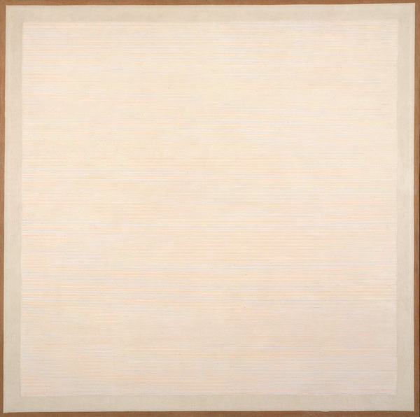
Again, I’m not a painter, but I sense decisions in Milk River that are similar to those made in Newman’s painting. (And again, we can’t appreciate the care and quality of Martin’s painting by looking at that reproduction. It’s not even close.) I recently sat in a room at the Whitney Museum in which a number of other Agnes Martin canvases hung together. Together they comprise a 12-part painting called The Islands, and I liked them quite a bit. (I’m not reproducing them here only because I don’t have access to any press-approved images of them.) They were in many ways refinements of the style and project in Mink River, and were composed of paint and what the labels called “graphite.” A similar Martin painting at the Museum of Modern Art listed “pencil” instead of “graphite,” but you get it: there is paint, and then there are carefully measured and drawn pencil lines that create regular columns, rows, or grids. The Islands paintings are variations on this technique, with the decision made in each painting being, essentially, how far apart to place the pencil lines.
If you’re like me, you’re thinking about how you could make a painting like this yourself. Abstract painting often provokes this response, and rather than challenging or refuting it, let’s do a thought experiment in which I reproduce Agnes Martin’s The Islands. First, I need to buy a bunch of canvases. They’re big canvases, so I’m going to need a truck to get them home. It might take a few trips. Wait—where can I get these canvases? They don’t sell canvases this large at the art store, do they? Am I going to have to stretch these canvases myself? Because I don’t know how to do that. Also, even if they are available for purchase—where am I having these canvases delivered? I don’t have a space in my home where can work on canvases of this size, so I’m going to have to rent some studio space somewhere and have the canvases delivered there. This is starting to sound expensive, but let’s keep going. The next thing I need to do is buy paint. What kind of paint? Um…I don’t know. I think she used oils. Or acrylics. I’ll look it up. Even if I know what kind of paint, though, I’ll need to pick a shade. What shade should I pick? Again: I’m not sure. Also, can I just use the paint straight out of the tube (it comes in tubes, right?), or am I going to be thinning it somehow? And hold it: What kind of brush will I be applying it with? And will I need to prepare the canvases in some way before I apply the paint? And do I need to prepare the brushes? People don’t prepare brushes, do they? Wait—I need implements other than brushes, too. What are those? I have to choose some other paint-working implements to buy.
I’m going to stop. I’m getting tired of making decisions—or, because I actually lapsed into questions, I’m getting tired of not making decisions, of being unable to make these very basic painting decisions. And we didn’t even make it to pencils. This is why I’m a one-decision painter: I don’t paint.
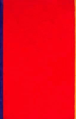
I’m bringing all of this up, though, just to suggest that if you want to have a sense of why people get worked up about Mark Rothko, it’s important to see the paintings in person. Here is Rothko’s Untitled, 1963:
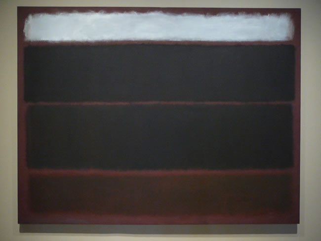
Simple. Some colored shapes on a canvas, similar to the Newman painting. A kind of compositional balance and symmetry, similar to Martin’s paintings. But here is a detail:
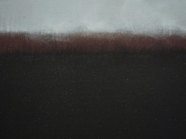
Differences. Newman’s decision to place a yellow stripe at a certain point is a final decision—once the stripe is painted, the painting is complete. Martin’s decision to draw pencil lines at exact intervals is a final decision—once the measurement is decided on and the lines are drawn, the painting is complete. And let’s keep in mind, from my failure to even get through a thought experiment in which I recreated the Martin paintings, that I feel that both the Newman and Martin paintings are, in and of themselves, achievements. Neither Newman nor Martin had the luxury of thinking about recreating a painting they already knew was good—they painted their canvases without knowing the results were going to be good. Recreating a painting is, psychologically and emotionally, extremely safe. I’m not trying anything new when I recreate a painting. If someone doesn’t like it, I can claim that it’s the original painting they don’t like, not my own work. There is no risk in recreation. And yet I still couldn’t get through the thought process required to even consider it. Newman and Martin made these paintings without the comfort of safety, which is an entirely different creative space to work from. But Rothko works the transitions between his colors very closely, and he allows paint to drip or spray, and there’s nothing rigorously straight, discrete, or mathematical about it. It’s tempting to call it messy, except that it’s not the result of carelessness, but in fact its opposite: it’s the result of someone caring about tiny details, of taking the time to work every inch of the canvas.
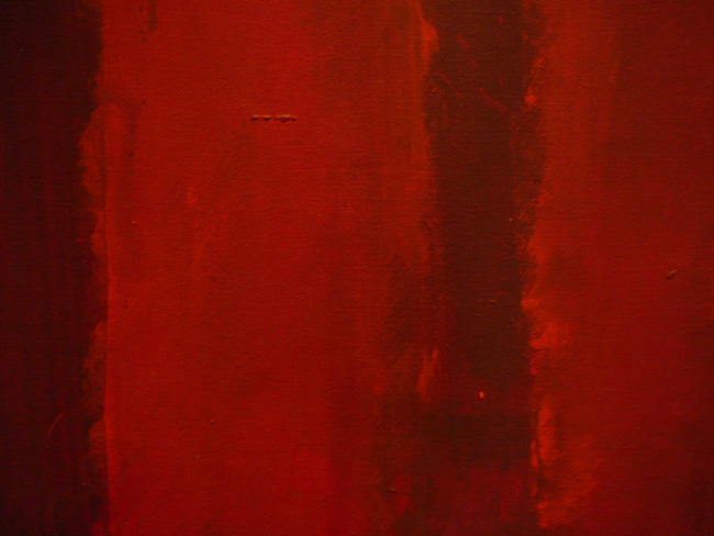
Here is another detail from a Rothko—this is from No.15 {Dark Greens on Blue with Green Band}, from 1956:
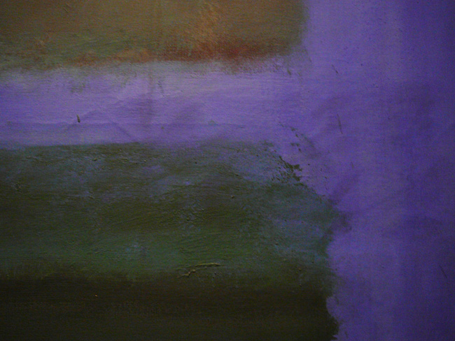
How many colors are there? I don’t have a definite answer, but what’s important is that Rothko’s paintings invite multiple viewings, because they are not what they appear to be. They appear, at first glance, from a distance, to be a few colors. They are often, in actuality, many colors. They appear to be regular shapes which, once selected, would end the need to make any further decisions about what shapes to paint. Upon closer inspection, though, one finds that when Rothko might easily make a final decision—or finish a painting—by selecting a uniform mathematical or geometric solution, he instead chooses to complicate what he’s doing by making all sorts of individual little decisions as he works across the canvas. His lines do not appear to be carefully measured. His stripes are not exact. His shapes do not have definite edges, but neither is the haziness of the edges a consistent haziness. Despite its name, there are more colors than just green or blue in the above painting. There are hidden layers. The hidden layers contribute to what we see on the surface. And sometimes they show through.
The commitment to making new decisions across every inch of the canvas is part of what makes Rothko interesting. I did not, even at 4:55, when the others visitors had left and the entire exhibition was empty except for me and a lone security guard, find myself spiritually moved by the paintings. Maybe that can’t happen again. Maybe something is wrong with me. Who cares. I can notice that the complexities of brushwork and color and shape that Rothko brings to even the smallest areas of his canvases makes those small areas almost paintings of their own. Is there a difference between being moved by a painting and being moved by a painter’s commitment to a painting? If there is, Rothko’s work—the sheer physicality of it—may at some level be an attempt to collapse that difference.
This is a close section—just a few inches—of Untitled, 1969:
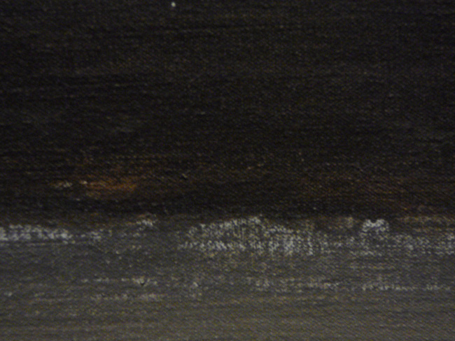
There’s something behind the darkness. And here is a section of one of the Seagram mural sketches from 1958:
Consider an item from Jacob Baal-Teshuva’s book on Rothko, which I looked at again after my recent visit to the retrospective: “During the months in which he worked on the Seagram murals, he completed three series of gigantic wall paintings, approximately 40 works in all, and for the first time in 20 years made painted sketches as studies.”
That gives me pause. The Portland Art Museum show features three Seagram mural pieces—they are, each of them, paintings Rothko considered sketches. I lack the mental endurance necessary to get through even just a thought experiment about reproducing a white canvas with pencil lines on it. In 1958 and 1959, Mark Rothko completed dozens of paintings that are massive in size, possess multiple layers, are created via treatments and techniques some of which are unknown, and bear evidence that, even in his “sketches,” he chose to continue making decisions with his brush across every inch of canvas. Yes, he had assistants who helped with some aspects of preparing the canvases, but this strikes me as yet another decision, or series of decisions, he faced and made that I wouldn’t have the slightest idea how to negotiate. What do I ask the assistant to do? What do I not trust the assistant to do? What am I physically capable of doing? What am I not physically capable of doing? Rothko faced these questions and made decisions.
 When the gallery began to fill with the people coming in at 5:00, I left. And I thought I had probably seen something that the evening’s crowd, if it was composed of good, polite people who would not want to get in each other’s way, might not see: up close, inches from the canvases, there is quite a bit of evidence that Mark Rothko was fearless. He did not shy from decisions, and the complexity and beauty of his work is, in many ways, a result of his willingness to engage further and further questions across the breadth of his canvases. Some of Rothko’s decisions I am, as a moderately intelligent thinking and feeling person, able to sense. But some of the power of the paintings derives from the fact that they are also the result of decisions I can’t sense. Rothko is answering questions and making decisions at levels beyond me. I have visited the Rothko retrospective multiple times and have tried twice to write about it, but all I can offer right now is: During the months in which he worked on the Seagram murals, he completed three series of gigantic wall paintings, approximately 40 works in all, and for the first time in 20 years made painted sketches as studies. And the mental, physical, and creative endurance required to do that is difficult to fathom. I don’t know how he did it. And no matter how many times I look at the paintings, I don’t think I will.
 Dan DeWeese is Editor in Chief of this magazine. His novel, You Don't Love This Man, came out last year.