

Craft
Kish Chases the Whale:
Making Moby-Dick in Pictures
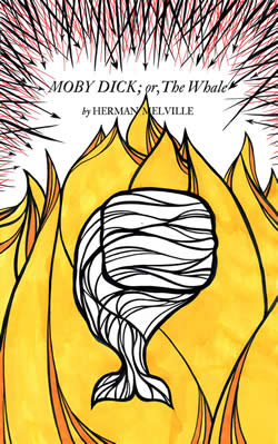
 Really, I just wanted to make a version of Moby-Dick that looks like how I see it. That's all." That's how the introduction to Matt Kish's Moby-Dick in Pictures: One Drawing for Every Page begins. What follows is 552 pages of illustrations: one for every page of the Signet Classics paperback edition of the novel. Kish, frustrated with his artistic process, invented the project of doing one illustration per day, from the beginning of the book to the end, as a way of both challenging and freeing himself as an artist. He began on August 5, 2009, and finished on January 29, 2011. Somewhere in the middle, the project turned into a book contract. Now more than a year removed from completing that last drawing, Kish shared some of his thoughts about the project. —Dan DeWeese
PROPELLER: In the intro to Moby-Dick in Pictures, you mention that you've read the book a number of times. I had only read abridged versions of Moby-Dick before, so over the holidays I spent some time reading the whole thing. As credit for this, may I ask a question about the text before we talk about your illustrations? What are a couple of your favorite parts of the book, and why?
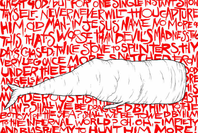
 MATT KISH: While I am quite fond of many of the more popular and well-known chapters, especially the very first and the final trilogy of chapters describing the chase and last battle with the White Whale, there is another which is notable and which seems to surprise everyone I tell. "Chapter 32: Cetology" is sometimes described as the book's line in the sand. That chapter, basically a lengthy recounting of the different types of whales based on their size and characteristics, is deemed by many people to be one of the driest, dullest, and most difficult to slog through. It's almost as if Melville has cast the gauntlet for the readers that have come that far. If they can make it through this hurdle, then they have truly earned a place on the voyage, and if not, they were never strong enough for what was to come. I am a currently a librarian, but this stems from a lifelong love of books, or organization, and of classifying things. Chapter 32 appeals to me so deeply precisely because it is a relatively style-less, clinical recounting of a catalogue of monstrous whales. It's almost an encyclopedia entry. Honestly, I could read and re-read that chapter, and I looked forward very much to illustrating it because I knew it would be an excuse for me to spend hours and hours drawing whale after whale after whale in a variety of odd and unique styles. It is this obsession with detail, this bizarre mosaic structure of the novel with all of its ill-fitting chapters and styles jammed into one creaking and lurching whole which appeals to me so deeply.
PROPELLER: I found the opening of the book, in which Ishmael travels to Nantucket, meets the harpooner Queequeg, and signs up to join the crew of the Pequod, entirely engrossing. Melville renders Nantucket and its inhabitants so otherworldly that there was almost a science-fiction feel to it. The book shifts tone often, though, because, as you note, it encompasses so many kinds of material. Were there certain sections or kinds of material that you felt particularly fit your skills as an illustrator? Was there any particular material you found challenging to illustrate?
 MATT KISH: It was the whales, man. Always the whales. See, the last art class I took was a basic drawing class as a freshman in community college way back in the fall of 1987. Since then, nothing. Sure, I've drawn a ton, but I'm not sure how much that counts. Maybe as practice, but certainly not as an education. So there are, embarrassingly, a lot of basics of art and rendering that I lack. An inability to depict anything realistically is one. A staggering inability to draw the human figure, let alone feet and hands, is another. That's why I gravitated to the chapters like "Cetology," or any chapter which looked especially closely at whales. There, I felt like I could exploit my limitations and really just let my imagination run absolutely wild. That real difficulty with the human figure is also a big part of why, if you look closely, all of my sailors, mates and captains look like a hybrid blend of human, ship, and mechanical body. I mean, that really started with me thinking about what it must have been like for a person to leave the warmth and safety of a home and a bed and a family on shore and sail the sea for 2 or 3 or even 4 years straight, hunting and basically stabbing to death with little barbs of iron the largest and most monstrous creatures to ever swim in the sea. I just couldn't even grasp what kind of willpower something like that would require, and the only way I could make it real with these characters, with these illustrations, was to take that willpower and make it explicit. To symbolize it in broad and maybe even obvious strokes. So these sailors became unlike men, they became something like the ships of wood and iron that they sailed on. That was the only way I could see it, and in the end it worked out the way it had to. It felt just right. I could relate to them then, and I could see the story better.
PROPELLER: I love your phrase "exploit my limitations," and it's intriguing to hear you describe the actual act of illustrating—of working in a kind of gray area of what could/should/would be done—as being something that helped you to see the story. I think non-artists often assume that an illustrator closes his or her eyes, mentally "sees" an image, and then just tries to copy that mental image on paper. What you're describing is more complicated than that. To what degree do you feel your materials—mostly acrylic, colored pencil, and ink—also influenced the way in which you saw the story? In other words, if you'd given yourself a rule that you would only work in charcoals, would you have done the same illustrations, just in charcoal? Or is there a way in which the media influence the vision, and if so, how?
 MATT KISH: Prior to this project, nearly all of the art I had ever created had either been pen and ink or colored pencil only. That's it. So I had become extremely comfortable with those media, almost to the point of, as you mentioned, being able to close my eyes and mentally see a nearly complete image. I've long struggled with that idea that an artist must constantly push beyond the comfort zone in order to continue to evolve. Before the Whale, I tended to believe that there was nothing inherently wrong with sticking to a specific medium or style of representation, even if it felt comfortable and familiar. For me at least, creativity was something that I felt should bring some kind of sense of inner peace and accomplishment, and constantly treading the razor's edge of discomfort and instability seemed to be the stupidest way to achieve that. Since I've finished the project though, I've been able to look back at the series of illustrations, of which the last 150 or so are among the very best pieces of art I've ever created or ever even seen, and understand that part of the alchemy that created them was the wild terror of working in unfamiliar territory, with barely controlled media, learning and struggling and fighting and raging as I went. So, to circle back to your question, by opening myself up from the very beginning to assault this monstrous endeavor with no rules, no specific style of representation and no set media actually freed me and prepared me for the challenge itself.
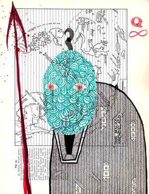
The media does significantly influence the vision because each media brings with it possibilities and boundaries. I refused to be contained though, so those boundaries existed only as far as my choice of media for each individual piece. Central to my decision to depict this great novel in such a wide variety of styles and media was an effort to visually parallel the vast, sprawling mosaic nature of the novel itself. Equal parts lurid adventure story, American Renaissance philosophy, dry zoological history, religious investigation, theater, poetry, and prose, the novel does not allow itself to be pinned down. I wanted my art to show that. I wanted to present these images as the way that I, Matt Kish, saw the novel, though this is only one of an almost infinite number of ways to see the novel. It was never my intent to create some kind of definitive vision. This is but one facet of an enormous work, and a humble footnote to the history of art and imagery that has accrued around it.
PROPELLER: With the idea of translation via medium in mind, I wonder if you've seen any of the film versions of the book, and if so, what you think of them. No one has been daring enough to stop a narrative film of the book in the middle in order to do fifteen minutes of documentary on cetology, so that experience of a "line in the sand" chapter that you mention above isn't reproduced in movie versions. Is Moby-Dick unfilmable? Or, as a visual artist who has now illustrated the book, are there visual strategies you think a film could use to get close to capturing the feel of the book?
 MATT KISH: This is a particularly interesting question for me because my first experience with Moby-Dick was as a five year old child seeing the 1950s version on television on a Saturday afternoon at my grandmother's. It was my habit to watch 4 hours of Japanese monster movies every Saturday at my Nana's, where my parents would drop me off. For some reason, one Saturday they were a bit late picking me up and the monster movie marathon morphed into Moby-Dick almost seamlessly. What struck me then was that here was a monster that could have almost been real. I knew the ships and the men looked like they could be real. Even then, to my young eyes, I could tell they were "history." But then there was this huge, wrinkled White Whale rolling through the waves, a hateful eye staring balefully out of the TV screen. I talked about that movie incessantly and very soon after that my parents gave me a copy of this tiny, roughly 4-inch by 4-inch, heavily-abridged version of the book. It had around 200 pages, but every other page was an illustration. It had just the basics of the story, but enough to hook me. When I think about these two things, my first introduction to the great story and the poles around which it would always revolve, what strikes me is that each time, the story was conveyed in a visual medium. So to me, Moby-Dick has never been just a book, or just words on a page. It has always been visual, it has always been imagery, it has always been accompanied by and told through pictures.
I've not seen any of the other film versions of the book and I have very little desire to do so. I have a fairly dim view of big-budget filmmaking, and taking risks is always last on any producer's list. I fear that were I to spend any time with the other versions I would find something either slavishly devoted to the public perception of what adapting great literature must be or ludicrously over the top with special effects and action. I would actually be fascinated to see precisely what you mentioned, a lengthy film adaptation of the novel that uses the language of cinema to explore the various narrative styles of the text itself. A 15-minute digression on cetology would be brilliant, but it would probably alienate as many moviegoers as the chapter does readers. Moby-Dick is indeed unfilmable in the sense that it would be too expensive, too erratic, and too risky for almost any studio, director, or producer to gamble on. Especially in a time when the vast majority of theatrical releases are either sequels or safe-as-milk adaptations of previously existing and very familiar comic book properties.
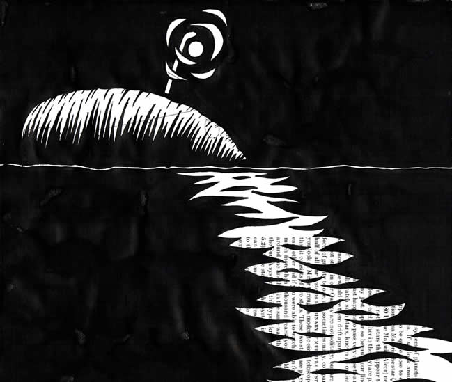
I know very little about filming, or the language of film, but it would be brilliant and, I think, a triumph to see a 12 hour film of Moby-Dick incorporate color, black and white, documentary, action, animation, stop-motion, and so on, to take viewers on the same kind of visual journey that the novel takes readers. I don't think I was even able to really get close to that with my own illustrations since I was parceling the work out into single-day, single-page explorations rather than sustained chunks of narrative. But, as Ishmael mentions, there is something to the idea that the whale must remain "unpainted to the last."
Page 478 : "The waif-pole was thrust upright into the dead whale's spout-hole; and the lantern hanging from its top, cast a troubled flickering glare upon the black, glossy back, and far out upon the midnight waves, which gently chafed the whale's broad flank, like soft surf upon a beach." 9.75" by 8.5". Ink on found paper. Matt Kish, December 5, 2010.
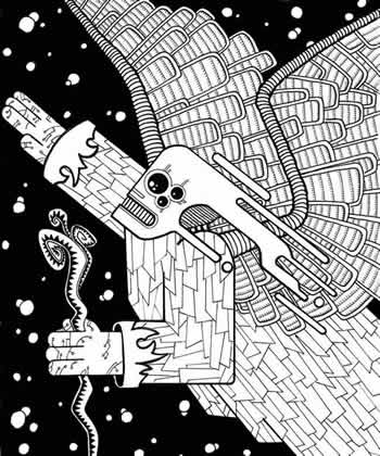
PROPELLER: Well, even though you say you know little about the language of film, one of the reasons I wanted to ask about it is that by challenging yourself to fill a frame with a meaningful image over and over again—552 times—it seems like you're wandering very close to the challenge of a film director. You mention being particularly pleased with the last 150 pages, and one thing I found pleasure in during those pages was not just your skill as an illustrator, but also some of the compositions you use. An example might be something like the winged creature on page 456, flying through space. As someone who doesn't draw, I can't figure out whether you started working from the left side of the frame, from the right side of the frame, or maybe in the middle, but the resulting composition is incredibly dynamic. (Another example might be page 478, which includes this beautiful broken line of lamplight on water.) Over the course of 500 pictures, did your sense of how to organize a frame change? Did you hit upon compositional strategies you hadn't thought about before this project? Or does the placement of items and lines in your images emerge as you draw, without pre-planning?
 MATT KISH: At the risk of filling this with a lot of "Aw, shucks" blather, I have to admit that the practice of composing an image is for me completely intuitive. And I think that shows, especially when surveying the wider body of my work. There are drawings, or photographs, or pages from a comic where I think I fail utterly at composition. But I always tried to learn from those, to look at those pieces and figure out for myself just why they didn't work. I think I've gotten a great deal better at composing an image and a lot of that comes from trying something new every single day for almost 18 months. It becomes a kind of perfect laboratory in which to experiment, evaluate, and experiment again.
I believe that the compositional strengths I do have come from, literally, a lifetime of looking at and internalizing images. I have an uncommonly tenacious memory, especially for imagery, and I feel as if I can recall almost everything I've ever looked at. I tend not to break these things down, deconstruct them, or try to figure out how they work. Instead, I hold most closely the images that have provoked a powerful and visceral response. The things that I simply liked looking at. Those stay with me and there are now so many in my head that I am sure there is some sort of unholy alchemical broth in there combining and recombining things, spawning an ever-growing series of new images.
I think I've been lucky in that, for me, the art I make grows organically. I do very little sketching or planning and instead play with the visual in my mind until I feel I am ready and it is "locked in." At that point, I simply begin with whatever part of the image suggests itself to me as a strong foundation for the rest, and I build out from there. The most fascinating part of this process is that, to paraphrase Diane Arbus, nothing ever turns out exactly as I intended it to. They are always slightly different, always unexpected. I think that, more than anything, keeps pulling me back to the drawing table.
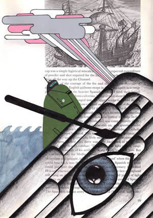
 PROPELLER: Speaking of the drawing table, I want to make a minor, facetious complaint about some of the media labeling in the book. Most of the images are listed as being created on "found paper," and in the book's intro you explain that you had many random old books, mostly of a technical variety, whose pages you used as paper for these drawings. Your selection of found paper is very clever—there's often an interplay between the content of the background page and the content of the illustration you've created over it. But I experienced a kind of shock when on page 440 you drew on an actual page from Moby-Dick. Though I understand that the label "ink on found paper" is technically accurate, once you're drawing on actual pages from Moby-Dick, the paper is not quite found, it's selected. I'm only airing this complaint because though your book is an achievement in drawing, the more I looked at it, the more I realized that there's more going on than just drawing. Did you hesitate at all before the first time you used an actual page from Moby-Dick as "found paper"? How did you decide on which images you would go ahead and do that? I found it oddly moving, especially toward the end of the book, because one has the sense that the images, rather than chewing through the pages of old manuals, begin chewing through Moby-Dick itself. Something about it suggests a project annihilating itself.
MATT KISH: Ha! Well, your complaint is duly noted and grudgingly given credence as somewhat accurate. Mostly I kept calling it "found paper" because I had no other idea what to call it, and because this thing really started and lived for many months as a blog that I thought I'd be able to use to share art with grandparents in Florida and friends in New York. Beyond that, I didn't think anyone else would ever find out, much less care, so in some ways I'm a little stunned I was as diligent in noting dates, dimensions, and media as I was. I suppose that's the librarian in me, though.
You've actually, perhaps unwittingly, hit on a bit of a dirty little secret. The ugly truth is that when I began this project, the use of found paper as a foundation for the art was for purely visual reasons. In the years leading up to this project, drawing for me had become an almost painfully stiff, laborious, and time-consuming process. It was no longer fun. My drawings had become so overly detailed and took so many hours to complete that I began to dread starting something new. I realized that I needed something almost violent and destructive to really brutally wrench me out of that old way of working and force me to appraise making images in a new way. I had experimented a bit with found paper, specifically the TV repair diagrams, about a year before the Moby-Dick project because I was drawing a series of robots—Robot Masters, really—as an homage to my childhood love of the Mega Man videogames. It just seemed like a natural fit: robots drawn and painted over electrical diagrams. I liked the way it looked and that stuck with me. As I began the Moby-Dick project, I remembered how much I liked how those diagrams looked, and I was drawn to the way the my own line work would fight against what was already on the paper. In doing that, in drawing and painting over something, I had to cede control of the image to visuals beyond my control. That really started breaking down some of the stiffness and laborious over-rendering I had fallen into. It felt good to let go, and over the course of the 552 illustrations I went from being terrified of even touching a paint brush, because of how loosely one had to let the lines and colors flow from it, to being almost addicted to that level of freedom. I never had this with pen and ink.
Shortly after beginning the project though, additional truths revealed themselves to me. I have a real abhorrence for digitally created or digitally enhanced art. Something about it always leaves me cold, whether I am seeing it in a book or comic or magazine or on a computer screen or movie screen. It's just dead, soulless product that seems to always follow the path of least resistance in its appeal. I've never had any desire to engage in that kind of thing myself, so after making just two or three of these Moby-Dick illustrations on found paper, on paper harvested from old and out of print books, I realized that I was consciously tying these illustrations and this project back to the tradition of making books, of physical objects, of art made by hand and made for eyes, not for computer screens. I truly believe that was lurking inside of me somewhere as the idea for this project grew—it just took me some time to realize it.
Honestly, the act of selecting a page for each new drawing was almost always a completely intuitive process. I would think about that day's illustration for quite some time and simply select a page that appealed to me visually. Sometimes that appeal would be because of a very basic visual connection, but something that was very surface. Some examples are page 37, an illustration of Father Mapple, being drawn on a page from an old book about ships because the image on the page reminded me of Father Mapple's pulpit. Page 74, explaining the somewhat archaic system of paying sailors according to a percentage, or lay, of the entire take of the voyage being drawn on a page of dry, dull text with the heading "The 1700s"—simple things like that "The 1700s" making me think of something old and quaintly anachronistic.
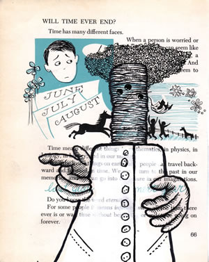 Over time, though, I think my intuition sharpened and my subconscious was working a great deal harder than I realized because odd, amazing and sometimes eerie juxtapositions would emerge in the illustrations that I had no real concept of until I had completed the piece. In some cases these had to be pointed out to me by other people, which was a bit unsettling. My favorite example is page 285, a simple drawing of the ship's cook, Fleece, more or less arguing with Stubb about the whale steak he has cooked for him. Fleece is a minor and somewhat pathetic character, but he earns our sympathy because of the abuse he suffers at Stubb's hand. We feel for Fleece because he is innocent and has absolutely no agency at all in contradicting Ahab, even though Ahab will ultimately cause Fleece's death. In my illustration, which was created on a page from an old children's book about time, Fleece is shown gesticulating somewhat wildly. His right hand, the active and moving hand, slightly covers the words "last year" from the children's book, while his left hand, which hangs dead and limp against his side, covers the words "next year." Last year Fleece was alive and well and active, while next year he will be dead and his bones resting on the bottom of the sea. That one shocked me a bit, since it was completely unplanned.
I deliberately avoided using pages from the novel itself for the most part simply because it seemed too easy, too obvious and too gimmicky. When I did, it was because I wanted the entire visual focus of the illustration to call to mind the White Whale, the centerpiece of the novel and the focal point of my own project. I believe page 176 was the first time I used a page from the book, and I did so because the text is a particularly vivid description of the White Whale and I wanted that to read in every line of the piece. Additionally, the page I selected, a title page, had a gorgeous bit of water damage along the bottom and that synchronicity was too perfect to pass up.
If anything, the nearer I came to the end of the project, the more I would use actual drawing paper and not pages from old books. Of the last 100 illustrations, 23 of them are on plain white paper. I've thought about this a lot. Why the change, you know? Two reasons. The first was a growing sense of confidence. I was nearing the end of this massive, idiotically ambitious venture and slowly growing convinced that I would actually accomplish what I had set out to do, and due to the constant discipline of making art every single day I was very sure of what I wanted to do with the brush and the pen. I finally felt certain enough to seize that control back, as if to say that I no longer needed that visual noise behind my art to force me to make images in new ways. I knew exactly what I wanted to do with each page now, and nothing would stand in my way. The second reason was that, at that point, this whole thing really felt like mine. This was my project, my book, my story, and my vision. It was a kind of fierce assertion of ownership, I guess. I shout to the heavens that this was my creation, unassisted and unaided by anything other than the words of a long-dead and possibly insane writer.
 Matt Kish lives in Ohio. Moby Dick in Pictures: One Drawing for Every Page is his first book.